Hi All,
Another good contest is open for the people who can think creatively and put their creative thoughts on images - The logo design contest.
The logo will be placed on the header of this website and will be used in other promotions. So your logo will have much importance it is selected.
Requirements:
- The logo must be unique
- You can use text or icons of your own but no copied ones are allowed. The logo name should be boddunan and the tag line should be "Information Creates Wealth".
- The logo should show your creativity
- The color variance should fit in the header of this website.
- The max height you can use is 80 pixels and max width can be 200 pixels
The winner of this contest will get Rs. 100 cash credits.
- Maverick
20 Replies
Hi,
I am herewith posting my new logo.
the logo description are as follows
1.The blue color has been chosen keeping Knowledge = Wisdom in mind
2.The dotted arrow symbolizes growth & transperincy (means Pure knowledge)
3.Illustration of Human faces with color variation symbolizes the difference in knowledge level.
4.The text is kept simple keeping the marketing part in mind i.e. it should be simple to Convey.
The overall thaught behind the whole design was that the logo should be driven by punchline yet the name should be prominent.
thanks & regards
Ruchika
P.S. (Looking forward from all of u for a feedback)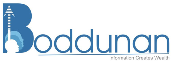
When I was writing the reply to Vijay's logo, this post was not there. And when I came back, I saw another wonderful design with the very good concept. And the actual contest is began. Now three logos with two wonderful concepts. Simply amazing.
Vijay wrote:
[quote]Its my next design.The pen denotes to write more and more. [/quote]
You are rocking Vijay. The idea of using pen and write more concept is amazing.
One small suggestion. The font used for the text is a normal font which is available to anyone. You can apply some effects/design to it so that it will be unique.
[quote]Its my next design.The pen denotes to write more and more.
[/quote]You are rocking Vijay. The idea of using pen and write more concept is amazing.
One small suggestion. The font used for the text is a normal font which is available to anyone. You can apply some effects/design to it so that it will be unique.
Ruchika wrote:
[quote]Hi,
I am herewith posting my new logo.
the logo description are as follows
1.The blue color has been chosen keeping Knowledge = Wisdom in mind
2.The dotted arrow symbolizes growth & transperincy (means Pure knowledge)
3.Illustration of Human faces with color variation symbolizes the difference in knowledge level.
4.The text is kept simple keeping the marketing part in mind i.e. it should be simple to Convey.
The overall thaught behind the whole design was that the logo should be driven by punchline yet the name should be prominent.
thanks & regards
Ruchika
P.S. (Looking forward from all of u for a feedback)
When I was writing the reply to Vijay's logo, this post was not there. And when I came back, I saw another wonderful design with the very good concept. And the actual contest is began. Now three logos with two wonderful concepts. Simply amazing.[/quote]
When I was writing reply to the Vijay's logo, this logo was not posted already. When I came back I saw another wonderful concept. Looking like the competition getting tough day by day.
Three logos with two amazing concepts.. Simply superb.
And one small suggestion again. The logo width should not cross 200 pixels as described in the rules. And the original file should be sent to Support team in order to be eligible, means the logo should be re sizable/editable and can be used in anywhere.
Hi,
Here Comes My second Version of Logo....
with Same Blue Theme
2. B formed with a element depicting upward arrow & Circles over laping expressing the target.
3.Eyes depicting - reading with a microscopic eye.
I am posting a 2 x size coz visibility will be less for review. :(
So Finally I will be left with one more last chance to come up with new Idea....
I request all the Viewers to give me ur inputs on color, elements & what all u feel can enhance the logo of the Great site www.boddunan.com.
Thanks & regards
Ruchika
Hi,
I am herewith attaching my final worked logo with all energeting | young & trendy colors just as the members of this site.
Any feedback please do revert to me....m eager to know ur sugesstions & feedbacks
Regards'
Ruchika
P.S. I din't received any feedback on my 2logo.....I request u to please revert.
Hi Maverick,
M really sorry for the Blunder......:-(
Well thanks too that u brought the same to my notice...
I also have a concern regarding the logo sourse files ....as U need it for the Web purpose the specificaions will be different to that when u require for it for print purpose.....
so,please let us know ...as to in which format the sourse file should be.
Regards
Ruchika
Hi Maverick,
One more thing....whenever I am posting the second logo...Via message I am not able to see the Image myself & also doubt that even others are not able to see it....i tried all the twikings that I could do... i mean the size ..pixels etc etc...
But m stillnot able to view it their ...but when i check in Preview its visible their...
Can u just temme whats the problem...so that if its with the image I could do something about it
regards
Ruchika
Ruchika wrote:
[quote]Hi Maverick,
One more thing....whenever I am posting the second logo...Via message I am not able to see the Image myself & also doubt that even others are not able to see it....i tried all the twikings that I could do... i mean the size ..pixels etc etc...
But m stillnot able to view it their ...but when i check in Preview its visible their...
Can u just temme whats the problem...so that if its with the image I could do something about it
regards
Ruchika[/quote]
We are able to see your logo. If you have any problem, you can upload on Submit Articles page, copy the URL and then post it here using the image button available on posting form.
Ruchika wrote:
[quote]Hi Maverick,
M really sorry for the Blunder......:-(
Well thanks too that u brought the same to my notice...
I also have a concern regarding the logo sourse files ....as U need it for the Web purpose the specificaions will be different to that when u require for it for print purpose.....
so,please let us know ...as to in which format the sourse file should be.
Regards
Ruchika[/quote]
First of all don't design the logo on normal editors like MS Paint which don't allow the customization without loss of quality. You need to submit the logo with the specifications mentioned in the first post. The logo will be used, but not limited, on this website, the newsletters, the address verification letters.
So please make your design to be flexible enough to customize. If possible, provide us in two or more sizes.
Topic Author
M
maverick
@maverick
Topic Stats
Created
Wednesday, 02 September 2009 16:25
Last Updated
Tuesday, 30 November -0001 00:00
Replies
0
Views
10K
Likes
0